
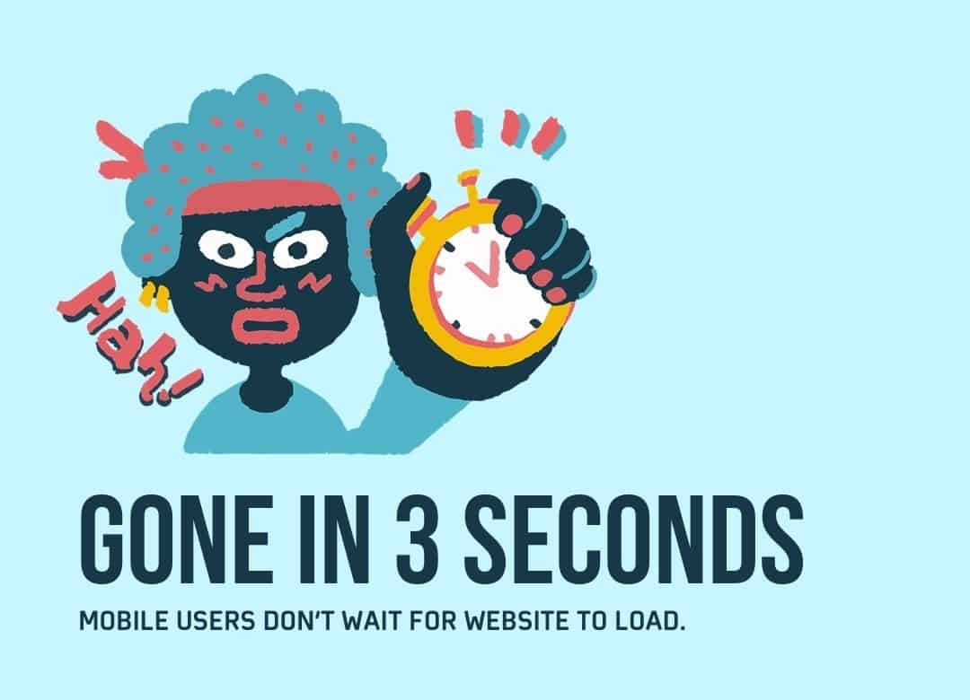
Gone in 3 seconds: Mobile shoppers don’t wait for websites to load
Despite the huge shift to online shopping, consumers give short shrift to mobile websites and mobile web-apps that don’t work quickly or look right, according to website testing platform LambdaTest.

Shoppers are proving to be fickle when they don’t get what they want from mobile sites of brands which are not fit for purpose on their device or browser. With short attention spans and limited user patience, time is imperative as more than half of mobile users leave a website that takes more than three seconds to load. Additionally, if a page takes five seconds to load the “bounce back rate” is almost 100%.
The LambdaTest data says that last year 4.57 billion people were accounted for as active mobile internet users, so brands “must prioritise their mobile sites or lose out on sales from those 4.57bn users.”

LambdaTest has pulled together 10 “top tips” (listed below), including ditching the navigation bar, keeping the menu short and limiting downloadable content to increase conversion from mobile shoppers.
By 2025, it is anticipated that more than 70% of internet users worldwide will only use their smartphones to access the internet – more than 4bn people. Businesses today need an online presence - whether for visibility or ecommerce or both - but “many business owners are still designing and developing websites for desktops and then trying to make them work well on mobile.” LambdaTest, a pioneer of cloud-based website testing, believes it should be the other way around, and if businesses don’t have a mobile-friendly website they risk missing out on Google rankings and sales.
Google has already responded to the accelerated trends, especially in light of the move to the remote and digital economy, with a mobile-first indexing algorithm that prioritises mobile website content over desktop websites.
Asad Khan, LambdaTest co-founder and CEO said: “Mobile users do not spend time waiting for the entire website to load. They want results immediately and within seconds, almost at first glance. The first impression is often the last impression in a web presence, and if your website takes time to load completely, they won’t wait. If your website is not presentable or breaks on their browser, they won’t stay. If your website has an important element say two scrolls down, they will switch.”
Khan issues a note of caution for brands that believe they have good mobile site but have no metrics to prove it. He added: “What does a mobile user seek on a mobile website? Mobile users are goal-oriented. Unlike desktop versions of a website, mobile sites must not fill their pages with unnecessary components. The components must also be strategically placed and prioritised in a way that works best for the limited screen size. This is why it is important to note down metrics and areas which are important to customers in a mobile view of any website.”
Khan also insists that a mobile-first strategy is not a one-time event. “Test, test and keep testing across multiple browsers and devices. Why? Because dozens of new phones and mobile browsers are released every year, and just because your website looks good on one device doesn’t mean it will look good on others with different screen sizes, viewpoints and resolutions.”
LambdaTest is a cloud testing infrastructure company that allows users to run both manual and automated tests on their websites and web-apps across 2,000-plus different browsers, browser versions and operating system environments.
The platform has been used to perform over 12 million tests in just three years, and is now being used by over 350,000 users across 132 different countries.
Top ten tips:
- Ditch the navigation bar. Simplify by using a short menu.
- Provide a search button and make it visible. A search button relieves the user of the responsibility of finding what they are looking for. Remember to put the search button on all the pages on your website.
- Vertical scrolling is always preferable. Mobile users are more focused on finding what they are looking for so help them to do this.
- Avoid pop-ups. Bad for UX and Google has started to penalise websites using full-page pop-ups and decrease their search rankings.
- Disable multiple tab system. A mobile browser does not keep the tabs side by side but stacks these tabs on top of each other.
- Provide click-to-call buttons for phone numbers. Design a click-to-call button where the user can automatically connect to the business.
- Move automatically in forms and validate inputs in real-time. Enable ‘move to next element’ allowing users to populate information without having to press into individual lines. End with the ‘go’ button to move to the next stage.
- Provide a home button on all pages. This will allow users convenient access to the main page without having to navigate. The logo of the company these days should be embedded to return to the home page. It is clean, convenient, and a good design method.
- Keep important elements within reach. Devices are typically used with one hand. Ensure actions buttons are centrally located.
- Compress necessary but irrelevant images. Using high-quality images will just lead to the bandwidth wastage. Use images that will allows better navigation.